Introduction
We have been working for a while on this game and our art is looking fantastic! Many thanks to the skill and patience of Liam Peters as well as concept artwork by Chuck Walton. However, we needed some help. We have a lot of symbols in the game and in order to make sure we kept on track for our timelines, we needed to bring in another artist. After posting in a number of places and asking around, Maura offered to help. She did a great job of maintaining Liam’s established aesthetics and adding her own style. She was quick, communicative, and quite professional. If you need an artist and she fits your game’s aesthetic, I wouldn’t hesitate for a moment to work with her.
So, without further ado, Maura Elko.
****
Ideas to Consider when Designing Symbols for Tabletop Games
By Maura Elko
In almost every type of board and card game you will have symbols that need to be designed. Whether they’re there to represent statistics, special powers, or just flavorful story themes, they’re all important for graphic designers and illustrators to get the right look and feel so that users have an easier time interpreting them.
Where to Start
Some symbols are widely used throughout a multitude of games such as health, strength, attack, defense, etc. I’m sure when you think about one of these words you’ve already got an idea in mind for a symbol to represent it. And that’s a good thing! It means there are some universal shapes and colors that the majority of people associate with them. Writing or sketching those down is a good place to start!
What if you want something different than the most obvious symbols, or the concept is more abstract?
It’s good to be creative and think outside the box. Brainstorm all the ideas you could possibly come up with for the word you’re trying to symbolize. Use a thesaurus, ask your friends or followers, think about how things work in nature, do searches online. Also, obviously no one wants to copy another game’s symbols, but it’s not a bad idea to see what other games use as well–or even just look at other artwork or photos. It could give you ideas for your own designs!
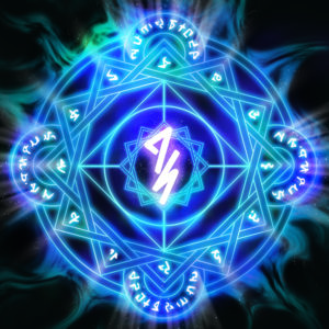
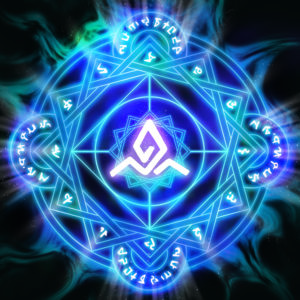
When I was designing the center symbols on these cards for Cult of the Deep, I jotted down all the ideas that came to my mind when thinking of the concepts. They were more abstract, so it was a definite challenge to get right!
Adding the Correct Colors
It’s important to choose the right colors for your symbols. Color itself is a type of symbol that can represent different moods or feelings. There are some universal emotions that are associated with colors. Most people think of red with anger or aggression, but also love; green with greed, or nature; blue is calming; yellow is usually a happy color, etc.
Shapes
When designing your own symbol, consider the overall shapes and the feeling they give off to the viewer. Sharp, hard edged, and diagonals usually represent uncertainty, destruction, rough concepts. Shapes that have a lot of curves and circles are generally more likeable, happy, or fluid ideas.
These shape and color ideas aren’t limited to symbols alone; they’re also found in character, object, and environment designs. Everything should have a reason for the shape and color it is, to try and convey its personality or meaning to the viewer.
There can be symbolism in almost anything!
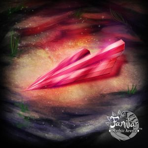
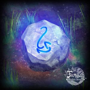
These are some of the item cards that show how color and shape work for the game Familiar: Mythic Arena (https://gryphonmountgames.com/familiar-mythic-arena) that I did the artwork for.
Final Thoughts
Coming up with your own symbols isn’t necessarily easy. And sometimes it could be going TOO far outside the box. In the end you still need to make sure the symbol you come up with works for the overall theme of your game, AND is intuitive enough for players not to get confused.
That last point is really important. Don’t overcomplicate things! Sometimes the simple route, and using the common universal symbols, is the best option. No one has a copyright on a heart shape, or cross to represent health for example. Make it your own by the artistic style you create it in!
Another thing to consider, in certain situations it could be better to just use text instead of a symbol. Sometimes it’s best just to spell it out instead of your players guessing and constantly referring back to the rulebook to find out what a symbol means.
Bio
I’ve been working in the digital art industry for around 15 years now. Starting with advertising graphic design and logos, then getting involved in computer graphics for games (3d modeling and texturing), and finally illustrations for board games. I enjoy both digital and traditional arts, and along with my husband have worked on designing our own games and created a company, Gryphon Mount Games (https://gryphonmountgames.com).
I love doing tabletop game illustrations, as I love playing these so much with my friends. Being face to face and having fun interactions beats out video games in my book!

****
Dice Giveaway
Don’t forget, we have a dice giveaway happening right now. Go to Dice Giveaway! and you can enter into a contest to win 1 of 11 Resin 7pc. RPG dice sets. Good luck and may the dice be ever in your favor!
