Sam “King of the Hilltop”
As we were developing our game, Cult of the Deep, there were many discussions about the look and feel of the game. How were we going to help people learn the game? What’s the best way to display information?
When discussing it, what became apparent for us was the need to have at least a base level of graphic design in order to really make the game work during the design phase. Now, we originally just used sharpies and paper but we did make the choice to involve a graphic designer early. Either way, the need to organize information into a format that benefits the players as well as help them learn the game is important. I would propose that you need to be thinking about the initial layout of how the game looks even while in the very first stages of development. Can those layouts change over time? Sure. In fact, they likely should. However, thinking about how a player is interacting with your game is of the utmost importance when creating a board game design.
I think of 3 major components to graphic design to keep in mind: legibility, thematic elements, and intuitive. I would even suggest them in that order.
Legibility
The number one priority of all the graphic design you will do, is it legible? Can people read the text? Can they see the symbols?
If people can’t understand or read the game elements provided to them, it’s going to be very difficult to play the game. This has to be the #1 priority for any game.
Now, some games can forgo a lot of text and that is totally fine. They might even be based completely on symbols. However, they still must be easily legible and able to be quickly understood.
Thematic Elements
This is the next step for me. How can the elements I have tie-in to the game? How can I sell the theme of the game? How do I get people to truly experience a game?
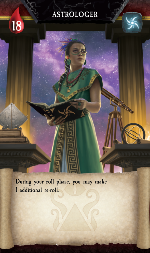
A great place to start after being able to understand and see the rules is to tie it all together with themes. A recent example is what we have been working on for Cult of the Deep. The theme is based on the idea that you are part of a cult. Now that can vary greatly based on the type of game or cult you are looking for. Ours has some nautical, maritime elements since we are working with the Deep. So, what works great that goes with magic, the sea, and cults? Parchment!! This element really makes sense and by having all of the text on parchment, it helps to set the mood.
Now, we needed a second texture to work with. Something that contrasts with the parchment, so it is legible, but also makes sense. We looked at some of the artwork and the setting we were in and some of the rituals and the location of where the rituals are happening were underground. There are altar boards, and lots and lots of stone. Well, if we used a dark stone, it could fit in. However, a rough stone makes things feel rugged or primitive. What if we did something more refined? A dark marble. It also had the great benefit of contrasting well versus the background that would roll over from the backs of the cards, to help differentiate the various cards.
Intuitive
Once you have established legibility and the thematic elements, it’s now time to see if you can put the final touch on a piece. Is it intuitive? Do people comprehend what something means just by looking at it? Now, many could argue that this belongs in legibility. It is most definitely related and it is something to be considered when talking about legibility. Here’s another example from our game.
Life used to be seen as:
Life = 18.
It’s very legible and it makes sense. During testing, we also noticed that many people kept looking at the corners of the cards for information. After a lot of discussion, we realized that it is common for games to put life or health in the corner of a card. So, even though the “Life = 18” was legible. Moving it to a corner made it more intuitive. This also came hand in hand by adding the blood drop symbol. Especially since in the game, when you roll the dice, the blood drop symbol is one way to gain life in the game. So, it tied in nicely with the dice, it was legible, it was intuitive. No one needed explanation of what it represented. Woohoo!! Mission accomplished. Only 50 more things to go! Just kidding. (No, seriously, if you ever make your own game, there are so many little choices to be made. It’s crazy!)
Recap
So, to recap, make sure your design work is legible first and foremost. If people can’t read or understand it, they can’t play it. Move into theming and try and make the pieces work together not only in color and tone, but also texture and symbols that make sense. Finally, iterate over and over again until the design starts to feel intuitive for players, specifically new players.
What do you think? Do you have a different way of approaching graphic design? Is there something missing here? Let us know.
The Mortar That Holds It All Together
Ed “Duke of BAzlandia”
This week graphic design has been one of the main topics of discussion between my brother and I. One of the things I never realized before creating a game is the importance of graphic design. I never realized how truly all encompassing it is and what it brings to the table. It is one of the things that can make or break a game if it isn’t done right.
When looking up definitions of graphic design there are several words that pop up over and over again in all of the definitions. These words are art, text, and communication. These words are vitally important to your game. One of the most interesting things about board games is that you have to be able to pick up the game, read the rulebook, setup the game, and then play the game correctly all without having someone who already knows all the rules and knows how to play. This is a tall order. To make it even more challenging, the graphic design presentation must communicate and streamline game play. It also must do this with the minimal amount of text as possible.
I’m going to go off on a little tangent here and try a little bit of a different approach to try and explain what I am talking about. I am currently working on an outdoor kitchen/grill area next to my pizza oven. I am currently at the point where I need to start laying brick for the walls before I pour the concrete countertops. When laying bricks there are a few materials and steps that are extremely important. Obviously material wise you need bricks and mortar. Your first layer or base layer of bricks is what everything is built on and must be level. To accomplish this you take the mortar and make a bed underneath the first layer of bricks. Now this mortar bed may vary slightly in thickness to make sure the top of the bricks are level.
Once this is done you then begin to build your structure, and you can vary brick layouts in different patterns etc. The thing that has to happen and has to stay the same is the mortar joint (mortar between the bricks) thickness stays the same and does not vary. This keeps the layers level and looks good.
Now you may be asking yourself what does this have to do with graphic design? Graphic design is the mortar. Illustrations, game mechanic, theme, player count, rules, components, and win conditions are the bricks in this examples. The mortar is what holds it all together and makes the pattern pleasing to the eye or, in this case, fun to play. All of these elements can be arrayed in different ways but the graphic design is what holds it all into place.
To further build on the allegory, given the mortar bed is really the graphic design and the base layer of bricks is the theme, presentation, and base mechanic, when players first interact with the game a good graphic design puts all of the players on the same base level. They all have a base understanding of what the game is about and at least some idea of what is happening in the game. When building the rest of the structure, the remaining bricks are the rest of the mechanics, rules, components, and player interactions that are possible while you play. The mortar joints, or the graphic design, hold these in place and presents them to the players in a visually pleasing way that allows each one to see the pattern.
Now I think I have taken this example as far as it can go.
In the end the whole point is that graphic design is really the glue that holds the game together.