Sam “King of the Hilltop”
There are so many different board games, types of board games, and themes that it can be overwhelming. What game should you play? Which game should you purchase? This looks awesome but how does it play? This game looks kind of lame but people say it’s good.
So many different ways to try and make decisions on what board game to play or purchase. It can be based on personal experience, recommendations from friends or a trusted reviewer, the artwork, the mechanics in the game, or even something else entirely.
However, one thing usually stands out over everything else when browsing a convention hall or social media – the presentation of the game.
What do you mean by presentation?
I am referring specifically to the look and feel of the game. By their very nature, board games are narratives. A narrative being defined as “a spoken or written account of connected events; a story.” This is 100% what a board game is. A narrative that is told between players as they navigate a system of interactions. In essence, a choose your own adventure story.
People make choices about games all the time based on their looks, and they are not wrong to do so. So, let’s break down the different parts of a board game’s presentation.
#1) Theme Imagery
This tells the player or customer what the overall feeling or emotion the game is trying to project. You show a game with trading in the Mediterranean, you can likely guess what kind of game it is. If you show a game with aliens attacking a bunch of super muscled soldiers, I think you can guess pretty accurately what the game is about.
But what about a game like Wingspan with a bird flying on the front? How is that going to help you guess what the game is like? Well, let’s break it down.
- Bird on front in an art style similar to that of older field manuals and guides – maybe something to do with collecting or matching?
- Light pastel colors – thinking something more friendly and possibly even relaxing?
In terms of imagery, Wingspan is very light with its approach but that is also why it works so well. It matches the play style of the game. When I pull out Wingspan, it plays how it looks. Nice, light, and appealing to my inner birder with a large variety of winged friends to play with.

#2) User Interface
How will a player know what to do? How can they quickly process all of the information provided to them in a game and then make calculated decisions in order to try and win a game? It all comes down to how the game is showing you how to play, where to look for information, and tell you what things are important.
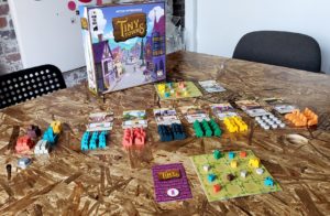
This is where good thematic artwork can really help you learn to play. Now, this does not mean complicated graphics or extravagant boards. Many times, simpler is better, especially if you can tell a story. I personally think a good example of this is Tiny Towns by AEG.
Each player board is a simple grid that is covered in grass. It’s literally that simple. You have resources and buildings that go onto that grid, with a series of cards that tell you how to put resources together on that grid to build those buildings. It is really quite simple and people pick up on it very quickly. It’s easy to understand the right way to play the game. You are building a Tiny Town! Now, learning the best way to win and beat your opponents…that’s a different story.

#3) Table Presence of Game Components
We are a very visual and tactile species. We create, organize, re-arrange, and modify things things just so it looks or feels better. You don’t believe me? Just post on social media asking to see people’s game shelves. Some will be messy arrangements but you will see quite a few with color coordination, size variation, and aesthetically pleasing organization.
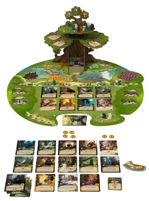
You can also try asking a question about people’s favorite board game components. There will be many responses about hefty poker chips, metal coins, and chonky dice. Or maybe it’s the little eggs from Wingspan or the berries from Everdell.
Look at Kickstarter. How many people spring for Deluxe Editions of games with miniatures or special components that serve the same purpose as other pieces, but have a heftier weight or a better visual appearance?
Having a game that is as fun to play with as it is to play is all part of table presence. Looking at how a game presents itself to its players in order to tell a story or share what an experience is going to be like.

Why is this important?
All of these design choices play a vital role in the narrative a player experiences when they play a game. It’s crucial. Now, not all games pay as much attention to these attributes. That can actually work for them as it signals to players what kind of game it is. A board game with dozens of charts, graphs, and numbers with a very limited visual aesthetic is a beacon for some gamers. I personally know a few. They love these types of games! It promises number crunching, probabilities, and well thought out decisions. They can’t get enough of it!
So, is it wrong to judge a board game by its looks? I don’t think so. In fact, I highly encourage it.
What do you think? How important to you is the visual or tactile experience of a board game? Do you have a favorite board game that you find visually appealing?
What Your Tastes In Board Games Says About You
Ed “Duke of BAzlandia”
When you discuss board gaming with another hobbyist, the inevitable question of what board games do you like or, how I phrase it, what are your tastes in board games? What is your flavor of choice? I find it definitely applicable that we use a word that normally used when referencing food. I have heard some descriptions of a new game described to me almost as a recipe. Well if you were to take this from X and that from Y and then add in a little of Z etc. The point is like food, presentation of a game is very important to some people. I personally have not cared much about food presentation. I am also not one to ask about food as I would eat at Taco Bell everyday if given the option, but there are people who the presentation of food is very important and the same goes for mixing food on a plate, for some foods shall not touch, end of story.
As my brother discussed – presentation – it is important to understand what people’s reaction may be. A great of example of this is Food Chain Magnate. Sadly I have not had an opportunity to play this but it is supposed to be a great game. I have heard people rave about how good it is and how wonderful its design is. The problems come into play with the presentation. I know people who simply refuse to play the game due to what they consider its “ugliness” or the “I just can’t stand to look at it”. Some people are upset that you wouldn’t play a game solely on how it looks but I know people who won’t eat Taco Bell based on how it looks. In something similar but different I can look at a fancy plate from a fancy restaurant and think to myself “Man, that looks good,” but I would never go out and pay that much for the food.
I will keep it short and sweet this week and get right to the point. The point is some people judge a game based on how it looks and will not try, let alone play, a game if they don’t like how it looks. That is ok. Everyone has their quirks and things they like and don’t like. Something to keep in mind with designing a game, if you want to appeal to and reach the most people, then considering how it looks and how it is presented is vital.
Despite the old saying “Don’t judge a book by its cover,” people always will.

Nice thoughtful analysis of presentation and imagery
Thanks for saying so. Would love to hear anymore thoughts you might have had.
It’s really great to see someone write an article about the visual appeal of board games. As a lover & admirer of art, I have been repeatedly and consistently blown away by the amount of great artwork that has been produced for games over the past decade. So many top notch artist have been tapped for game design that going into a game shop these days is a visual feast akin to strolling through an art gallery. Not only are we living in the most exciting era of gaming in history with literally hundreds of fantastic games being produced each year, but we are also living in what is without a doubt the most exciting era for game art. The amount of and incredibly high standard of art being produced today for games is staggering. Since I generally enjoy any type of game, the mechanics of a game are much less of a concern and it is the art, theme, and backstory of a game that appeals to me most since it is those elements that will draw me deeper into the game and help to immerse me in its world.
The one genre of game that I play the least are historical war games. While being based on actual battles helps to draw me into the game, I find that many of them have what I find to be a very boring visually esthetic that proves to be a barrier that prevents me from becoming truly immersed in the events that are unfolding before me on the tabletop. One historical war game that I absolutely can not wait to play though is Verdun 1916: Steel Inferno. Why? Because one of my all-time favorite comic book artists Jacque Tardi did the artwork and having been wrapped up in so many of his comics I know that seeing that same style of artwork on the cards for that game will immediately have me hooked.
If there is one style of game that I tend to enjoy above all others it is social deduction games. I always love a good mystery and so many of these games do a superb job of creating a mood and atmosphere through art and story and has me truly inhabiting the world set forth by the game. Being engrossed in the presentation of those games makes the mystery all the more tangible and makes for a thoroughly enjoyable gaming experience.
I love the art for these games so much that it is by far and away the number one factor in choosing what games I am going to purchase. Because I enjoy a wide range of styles of games and will most likely have fun playing just about anything, if I can play a fun game and enjoy looking at some fantastic art at the same time that provides a complete win/win situation for me. I love the art on many of these games so much that I have purchased games solely on the basis of the artwork alone. Tara McPherson is one of my favorite artists right now and when I found out she did artwork for a game called Dreamwell I immediately purchased the game knowing absolutely nothing else about it. I figured that if the game wasn’t very good I could frame the cards, display them on my wall, and at least continue to admire the artwork she did for the game. Luckily, the game is a lot of fun and has become one of my favorite games and since acquiring the game I have continually been contemplating buying a second copy of the game just so that I can frame the cards and proudly display the art on my walls.
I am a fan of the band Queens of the Stone Age and absolutely love the art that the artist known as Boneface has done for them over the years. When I heard that he had done the art for a game called Video Vortex, you had better believe that I headed straight over to Miniature Market and pre-ordered the game. When I finally received the game I opened it up and spent at least twenty minutes doing nothing but admiring his art. Luckily, again the game did not disappoint.
There have been many games that the main reason I’ve purchased them is because the artwork reminds me of the style of one of my favorite artists. Since having first seen the animated opening sequence for PBS’ Masterpiece Mystery as a little kid in the 80’s I have been enthralled by the work of artist Edward Gorey. When the game Gloom first hit shelves fifteen years ago I was immediately struck by the striking resemblance of the art to that of Gorey’s and just had to have that game. Another thing from my childhood were the Redwall novels by Brian Jacques and long before I knew who he was a large portion of time reading those books was spent admiring the absolutely fantastic artwork of Troy Howell. When I first saw the game Mice & Mystics on the shelf of a local board game cafe the art conjured up the art from those books in my mind. I was immediately transported back to my childhood spent wrapped up in the world of Mossflower from the Redwall novels and couldn’t wait to get wrapped up in the world of this game as well.
There are games from the past decade like Root, Stuffed Fables, and Everdell that not only are great games, but are absolute masterpieces in cartooning work. And it is with games like these that I am in a perpetual state of anticipating just waiting to see what absolutely stunning & delightful artwork is in store for games that are just around the bend. Thank you for writing an article putting a spotlight on the visual elements of gaming and I wish that there were more spotlights being put on the creative artists that help to bring the work of game designers into a vivid reality that us game geeks can thoroughly enjoy.
Hey Steven! Yup, I am a sucker too for great art and design. I like a lot of games but the visual presentation, theme, and specifically the artwork is what drives me to really experience a game.
It’s been interesting to ask the question in a variety of Facebook groups about the importance of art and surprisingly, there were a lot more people who said visualization is one of the most important aspects to a board game. I thought more people would go for base mechanics but…I was wrong. Never been happier to be wrong since I think games have a unique medium to showcase the visual elements of art.